
1. PPG Paints Swirling Smoke
Swirling Smoke is a go-to for Lee Crowder, a colorist with Darling Homes in Dallas, TX. “I have to stop myself from using this one too much because it is just a great all-around color. It is light with a tint of gray and is very calming.”
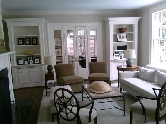
2. Benjamin Moore Cloud White
“Paint ceilings white and use lighter colors to make a room appear larger,” suggests Dan Schaeffer, owner of Five Star Painting in Austin, TX. “Think light grays, blues, and other neutral colors. You can also use an eggshell or satin finish to help reflect light.”
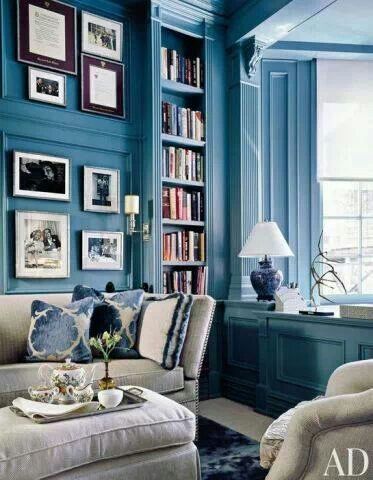
3. Benjamin Moore Hale Navy
Hale Navy has a spot on Benjamin Moore’s bestselling blue shades list — and for good reason. “It is a favorite to make a space feel bright,” says Sean Juneja, co-founder of Décor Aid. “I equate brightness with freshness, and Hale Navy is very fresh and clean.”
4. Farrow & Ball Skylight
“Skylight is also an amazing color; a clean, light gray-blue,” adds Juneja. “On a whole, cool colors are fresher and brighter than warm. Warm colors evoke intimacy and softness. Cool colors make me think of bright days and breezes and a sharpness that you can only capture with blues and greens.”
5. Benjamin Moore Navy Masterpiece
The matching-walls-and-trim tactic works with deep shades too (but beware that glossy finish). “I have done this same technique with darker colors as well, painting a formal living room Benjamin Moore Navy Masterpiece,” adds Charlotte Lucas, designer of Charlotte Lucas Interior Design, Charlotte, NC.
. “The darker color creates a more cozy and dressy environment. I suggest using a satin or semigloss … the higher the gloss, the more unforgiving the paint is!”
6. & 7. PPG Paints Geyser and Colonial Aqua
Lee Crowder suggests natural hues for this floor-to-ceiling trend. “Clean colors like celadon or a sea glass always make a room feel light and bright,” she says. “PPG Paints Geyser and Colonial Aqua are great selections for that feeling.”
8. PPG Paints Stonehenge Greige
Stonehenge Greige by PPG Paints is a very popular color that is light enough to enlarge a room but still gives you some of the modern and hip grays that are trendy right now.
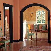
9. Benjamin Moore Orange Blossom
“Orange radiates warmth and generates happiness, whether it’s a tender, romantic hue or vibrant and energetic. Different shades are highly personal and subjective, but one thing is for certain: Using orange is always a bold and uplifting move,” says Amy Courage, co-founder and interior designer at DesignBar in Chicago, IL. “Benjamin Moore Orange Blossom is an elegant and sophisticated shade that enables the relaxed energy needed to make a room appear lighter and brighter.”
10. Sherwin-Williams Hazel
“This is such a peaceful and calming color,” says Alice Chiu of Miss Alice Designs in San Francisco, CA. “It can make a small space appear larger because it naturally brightens up a room with its vibrancy. It’s like being in the middle of an expansive ocean sparkling in a lovely mix of blues and greens.”
Source: http://www.trulia.com/blog/paint-colors-for-small-rooms/#sthash.IxpjnZjo.dpuf